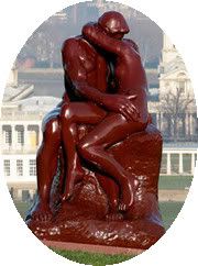
As you can see, I successfully modified my blogger template from a 2-column to a 3-column thanks to the "HTML for Dipshits" step-by-step help found at Beautiful Blogger. I would have preferred that the two sidebars both be on the same side, but just breaking all that stuff up into 2 sidebars is going to have to do for now.
Well, maybe I should say SORT OF successfully modified , huh? The main problem I had (besides the fact that HTML and WTF are synonyms as far I'm concerned) was that the background for the new left column wanted to be the same color as the main column. I wanted it to be the same textured white background as the right sidebar. Evidently, I'm not the only one with that problem, because every pre-formatted 3-column I could find did that. So through some blind experimentation, I got the white texture over there- yeah me!
But I need some help people!! PLEASE!!! How do I get rid of that thin line of background yellow on the left of the left sidebar? And how do I either get the left sidebar background to fill in the length of the page, or get the right sidebar background to stop in the same way as the left?
Here's where I'm guessing I need to do something:
#left-sidebar-wrapper {
margin: 0 auto;
border: 0;
width: 250px;
background: $mainBgColor url(http://www.blogblog.com/moto_ms/innerwrap.gif) top left repeat-y;
float: left;
color: $sidebarTextColor;
word-wrap: break-word; /* fix for long text breaking sidebar float in IE */
overflow: hidden; /* fix for long non-text content breaking IE sidebar float */
}
#main {
width: 420px;
float: left;
padding: 10px;
margin: 5;
word-wrap: break-word; /* fix for long text breaking sidebar float in IE */
overflow: hidden; /* fix for long non-text content breaking IE sidebar float */
}
#right-sidebar-wrapper {
width: 240px;
float: right;
color: $sidebarTextColor;
word-wrap: break-word; /* fix for long text breaking sidebar float in IE */
overflow: hidden; /* fix for long non-text content breaking IE sidebar float */
}
I KNOW there's just GOT to be someone out there that knows HTML/CSS/Blogger Widgets enough that they could offer this techno-tard some advice! PleasepleasepleasePLEASE???
I'll even let you pick a theme for my next Eye Candy post!
The Patchy Peener
14 years ago


2 comments:
That yellow line is the background of the main section.
Try increase the width of the sidebar (ie take 240 to 250) and give it a try, or else remove the padding:10px from the main section. (thinking about it, depending on where you situated the sidebar tag, the padding might be what needs changing.
AnneD
Thanks for responding, Anne. The padding is actually a later addition. The text for the center section was right on the line so the padding moved it over. It didn't have any effect on the bit of background showing to the left of the left sidebar though.
Oddly enough, if I increase the width of the sidebars, the text goes wider and outside of the parameter of the sidebars. That was pretty frustrating too.
I'm beginning to think there was a reason that all the 3-column Ms. Moto templates I could find left that left sidebar as the same background as the center.
Post a Comment